All visible things in webpage will be disappear, when we scroll down. Sticky bar in a webpage will stick to the webpage and fixed in a constant position. Here is the tutorial for how to Make Sticky Bar in WordPress Thesis Theme. In this sticky bar, it will have blog name, facebook like, google + button, search bar and go to top button. This bar will stick to the top of the webpage. This sticky bar will make user interface much better and user can easily navigate to home page.
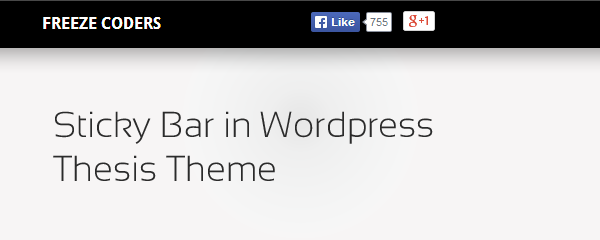
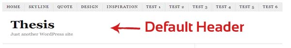
Sticky Bar in WordPress Thesis Theme
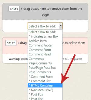
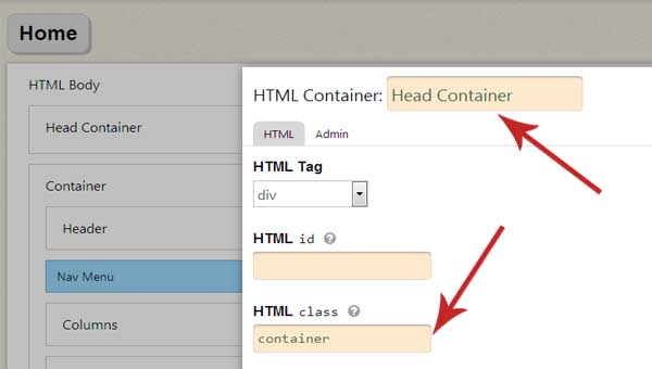
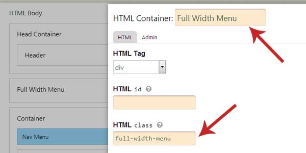
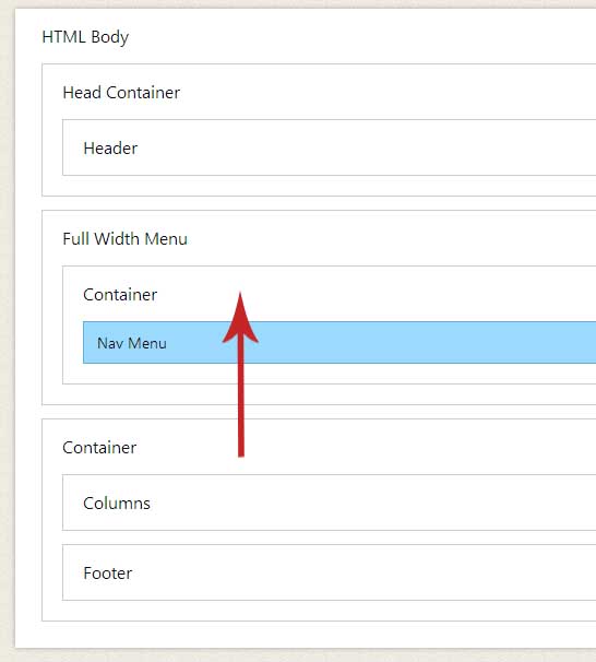
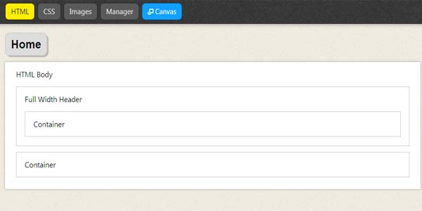
Step 1: Wordpress Admin -> Thesis(Left Menu bar) -> Skin Edior -> HTML Editor
Step 2: Add Textbox and give name as “sticky”
Step 3: WordPress Admin -> Thesis(Left Menu bar) -> Skin Content
Step 4: Put the following code in “sticky” textbox
[code type=html]
<div id=”sticky_outer”>
<div id=”sticky_inner”>
<ul id=”stickyleft”>
<li class=”logo”><a href=”/blog/#top”>Freeze Coders</a></li>
<li class=”fb”>
<div><iframe src=”http://www.facebook.com/plugins/like.php?href=http%3A%2F%2Fwww.facebook.com%2Ffreezecoders&send=false&layout=button_count&width=85&show_faces=false&action=like&colorscheme=dark&font&height=21″ style=”border:none; overflow:hidden; width:85px; height:21px; margin-left:38px” allowtransparency=”true” frameborder=”0″ scrolling=”no”></iframe></div>
</li>
<li class=”gplus1″>
<script type=”text/javascript” src=”https://apis.google.com/js/plusone.js”></script>
<div class=”gplus”>
<g:plusone size=”medium” annotation=”none” href=”http://www.freezecoders.com/”></g:plusone>
</div>
</li>
</ul>
<ul id=”stickyRight”>
<li class=”searchbox”>
<form method=”get” action=”http://www.XXXX.com/?s=”><p>
<input class=”sticky_input” type=”text” value=”Text to Search” name=”s” id=”s” onfocus=”if (this.value == ‘Text to Search’) {this.value = ”;}” onblur=”if (this.value == ”) {this.value = ‘Text to Search’;}” />
</p>
</form>
</li>
<li class=”btt”><a href=”#top” title=”Back to top”>↑</a></li>
</ul>
</div>
</div>
[/code]
Step 5: WordPress Admin -> Thesis -> Custom CSS and Put the following code
[code type=html]
#sticky_outer {
position: fixed;
z-index: 2;
top: -110px;
width: 100%;
height: 45px;
line-height: 45px;
color: rgb(255, 255, 255);
border-top: 1px solid rgb(72, 72, 72);
border-bottom: 2px solid rgb(0, 0, 0);
background: #000;
box-shadow: 0px 0px 3px rgba(0, 0, 0, 0.6);
}
#sticky_inner {
width: 970px;
margin: 0px auto;
}
#stickyleft {
float: left;
width: 68%;
}
.sticky_input
{
padding: 5px 10px;
border-radius: 19px;
border: 1px solid #000;
color: #C5C5C5;
outline: 0px;
box-shadow: inset 1px 1px 4px #6D6D6D;
-moz-box-shadow: inset 1px 1px 4px #6D6D6D;
-webkit-box-shadow: inset 1px 1px 4px #6D6D6D;
-o-box-shadow: inset 1px 1px 4px #6D6D6D;
-ms-box-shadow: inset 1px 1px 4px #6D6D6D;
}
#stickyRight {
float: left;
width: 25%;
}
#stickyleft li {
margin-right: 1%;
}
#sticky_inner li {
list-style: none outside none;
float: left;
}
#stickyleft .logo a {
width: 225px;
color: rgb(255, 255, 255);
font-family: “Droid Sans”,Helvetica,Arial,sans-serif;
font-weight: bold;
text-transform: uppercase;
display: block;
height: 35px;
}
.fb
{
margin: 11px 0 0 0;
}
.gplus1
{
margin: 2px 0 0 0;
}
.btt a
{
display: block;
color: rgb(204, 204, 204);
margin: 9px 0px 0px 20px;
background: none repeat scroll 0% 0% rgb(255, 255, 255);
padding: 0px 11px;
border-radius: 55px;
height: 29px;
line-height: 25px;
}
[/code]
Step 6: WordPress Admin -> Thesis -> Manage Boxes -> HTML Head Editor -> Head Scripts
Place the following code
[code type=html]
<script type=”text/javascript” src=”http://ajax.googleapis.com/ajax/libs/jquery/1.6.2/jquery.min.js”>
</script>
<script type=”text/javascript”>
$(function(){
var listval = $(‘#sticky_outer’)[0].offsetTop;
$(document).scroll(function() {
var topval = $(document).scrollTop();
if(topval >= 130){
$(‘#sticky_outer’).css(‘top’,’0px’);
} else {
$(‘#sticky_outer’).css(‘top’,’-110px’);
}
});
});
</script>
[/code]